


12 Pictures & a Graph
Got a minute to see how Trump's pick for Health & Human Services can transform our kids' health?

If you don’t have time to look at these images, click on the headline to move this to another tab for later.

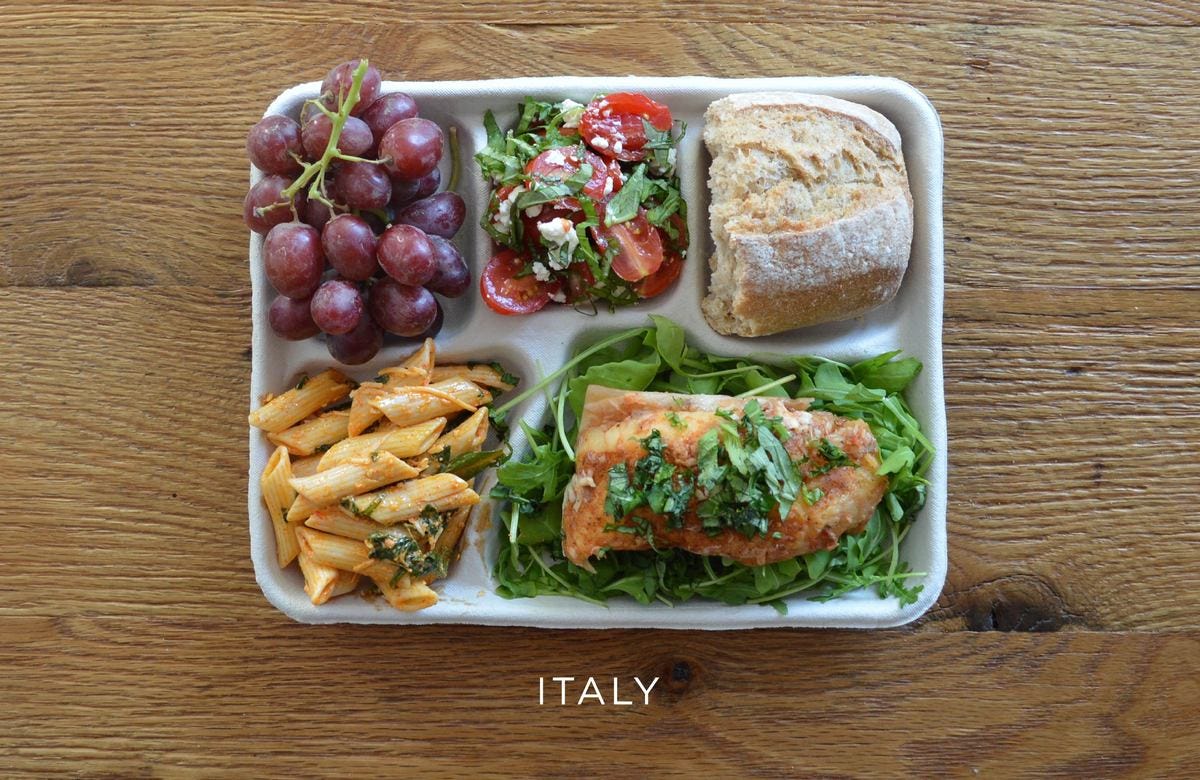
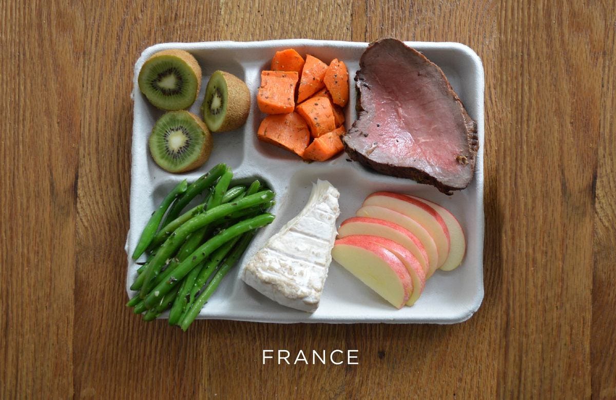
Sweden


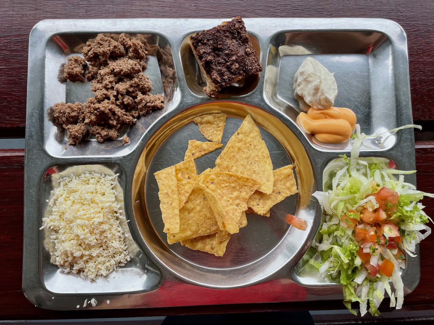
Colombia
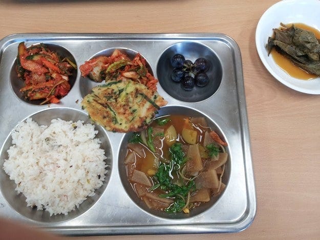
South Korea
Pickled sesame leaves, kimchi (fermented cabbage), doenjang (soybean paste) stew, rice, and grapes.
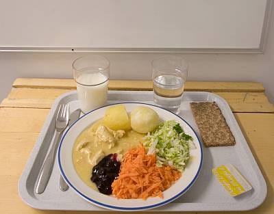
Finland

China
A whole fish, scrambled eggs with tomato sauce, rice, spinach, cauliflower and soup.


Taiwan
On the left - mushroom and minced pork. In the middle - Chinese chives stir fry with tempura. On the right - eggplant. Also - soup with radish and pork, and steamed white rice.

And what do our kids get?
Some crispy protein (fried "popcorn" chicken), a starchy vegetable that converts to sugar almost instantly (mashed potatoes), something green (peas), and 2 more servings of sugar (fruit cup and a chocolate chip cookie).
Which explains why, of all the nations, Americans spend the most on medical care, yet our life expectancy is lower than Chile and Slovenia.

See the pink dot way over to the right? That’s us, the outlier on this graph. The horizontal axis shows that we spend, on average, over $10,000 a year on medical care.
The vertical axis shows average lifespan. Americans live till 78, while European Union and Japan live longer even though they spend significantly less on medical care.
What do other nations serve their kids in school cafeterias that would help our kids make better choices while they’re growing, and beyond, into healthy adulthood?